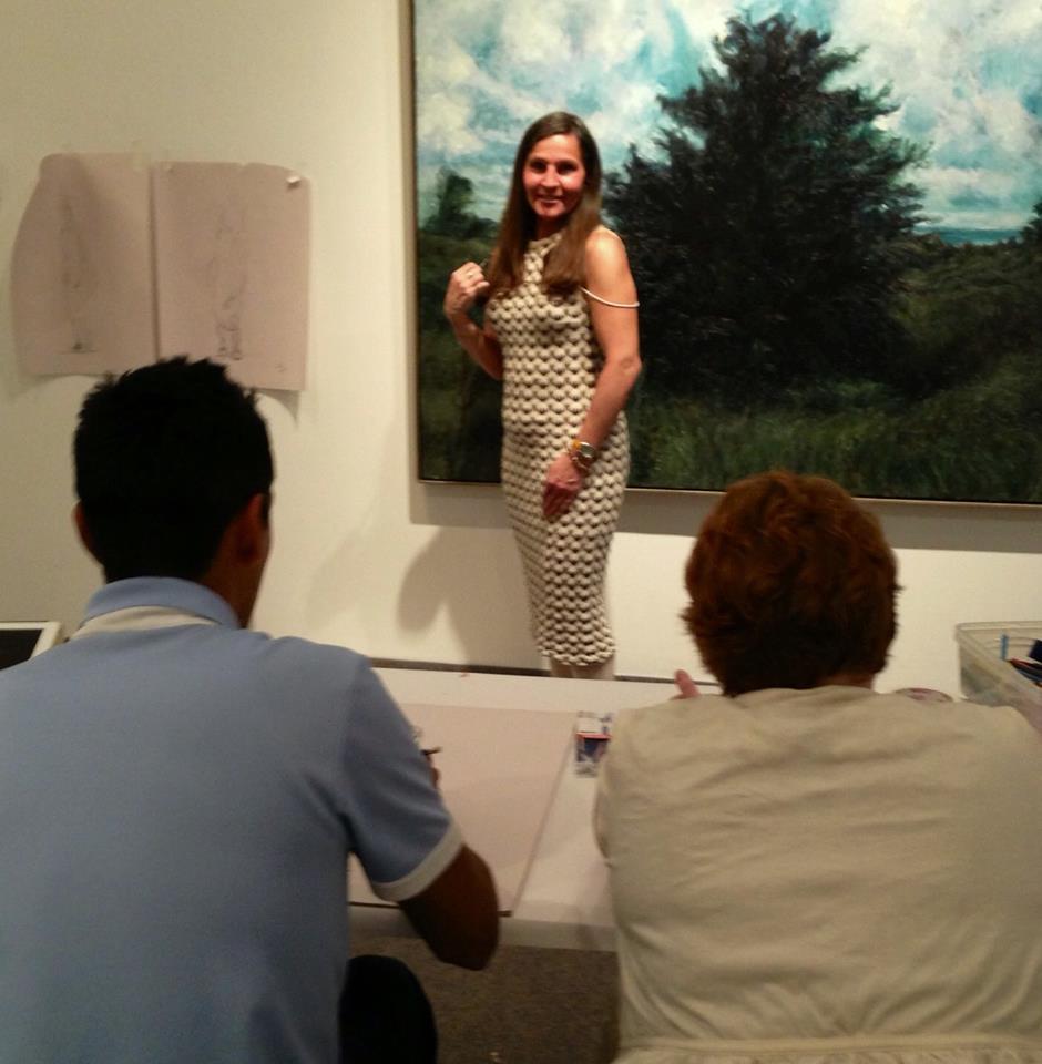
About
Roselyne Chues
Media:
- Painting – Oil; Acrylic; Watercolour; Pastels
- Sculpture – Clay; Glass; Steel; Bronze; Resin; Wood
- Video – Film
- Photography – Film; Digital
- Computer Skills – Photoshop; Adobe; Illustrator
- Installation Art
Award:
- 1995 Canada Council for the Arts individual grant / Canada Council for the Arts
Education:
- 2005 University of Western Ontario; B.S. (Hons) in Film and Visual Arts
- 1991 Ontario College of Art; Experimental Painting and Sculpture
- 1989 Ontario College of Art (Florence, Italy); Fine Arts
Future Exhibitions:
2013 “Pure Joy to Supers”, St Thomas-Elgin Public Art Gallery, St Thomas
Exhibitions:
2011 “Group Exhibition”; Creative Spirit Art Centre, Toronto
2008 “Rose ‘Hues Gallery and Artist Studio”, Talbot Centre, London
1999 “Greater Coincidences”, Beaver Hall Gallery, Toronto
1999 “The God Watches”, Station Art Gallery, Tillsonburg
1995 “Paradox/Pair O’Docs/Pear A Docs”, A Space Gallery, Toronto
1994 “The Introspective”, Taro Grill, Toronto
1994 “Devotional”, Cameron House Gallery, Toronto
1993 “Painting/Poetry”, The Show Gallery, Toronto
1993 “Sculpture Exhibition”, Pre-Lolla Paloosa, Toronto
1991 “67/91”, Ontario College of Art, Toronto

Roselyne Chues is an artist, living and working in Tillsonburg, Ontario. Chues studied art in Italy, Sweden and England and these early influences continue to impact her work today. Her creative process is explored through both sculpture and oil paintings; the rich and lush colour palette a delight to the senses.
Roselyne Chues’ current body of work ‘Pure Joy’ was influenced by the plethora of colours available and the rich tapestry that these colours create when the artist puts brush to canvas. Challenging the viewer to experience a deeper connection to the painting, telling their own story through the interpretation of the art, Chues’ subject matter comes to life.
Description of Pure Joy To Supers 2013
Celebrating people with challenges and their supporters by accepting and valuing their differences as currency.
Artist Statement: Understanding how a person with disabilities successfully functions in our society is a universal need. Regardless of your abilities, everyone faces barriers in their life. Let’s celebrate the individuals, their gifts, and the people who assist these outsiders. In my case, interpreting my ideas to the visual form changes my life. The Supers were born from these inclusive individuals who want everyone to be appreciated. Appreciating the outsider inside all of us and acknowledging ones that appreciate us, making us all one unit, is the focus of this new exhibition.
I want to celebrate the visual palate of colour, the language of objects, a jumping off point for many journeys for many viewers. I enjoy using different material to highlight ideas, for example the use of bronze provides an earthy glow that reflects the basis of an idea. Gold leaf also illuminates or frames an idea in dynamic ways.
Biography: My name is Roselyne Chues. I find myself enchanted by the beauty of nature, an aesthetic symbol everyone relates to. With dyslexia I did not fit into a society of letters and words, my focus shifted to the joy of my own gifts after years of isolation. The Pure Joy Series takes you on a journey. It celebrates the outsiders’ unique abilities through objects symbolically and figuratively. The Supers Series celebrates all outsiders’ inclusively.
Proposal: The flexibility of oil allows me to explore ideas with brush strokes and colour contrasts. This allow for the creation of lush white spaces within the media as a jumping off point. My goal is through colour and brush strokes to lull the viewer into a visual meditation that allows them to go into their own symbolic journey.
In the Supers, I use oil in contemplating the tradition of oil paints in portrait paintings, while using the format of comic book storytelling. Observing men as my viewers, I use my findings to create juxtaposition to the more feminine Pure Joy series. Gold Leaf illuminates and highlights the link to my next material: Bronze.
Varied sizes of bronze coins will be laid out in the entry creating a path. The experience is meant to create the understanding of acceptance as wealth and a linkage to the rest of the exhibition.
Two sides of a standard Canadian coin will be displayed in the center of the exhibition room. I will create a coin with one side being Pure Joy, the other side Supers. The side of the coin depicting nature represents Pure Joy, while the other resonates with the Supers. The meaning of the path is to create a feeling of awe through the viewer’s personal experience, walking through the coins leading them to an appreciation of the outsider in all of us.
Installation:
An Ironman/stainglass sculpture greets individuals into the gallery. The desired affect is one of welcome, iron for strength, stainglass attracting the viewer to the heart of the matter and the last symbol of a sword for our society to get to the matter swiftly. To this date the painting are still in process so the sculpture in latter described here was not affordable to make but still in process. A two piece path will be created by reproducing the two different side of the coin on to a canvas matt as path entering into the exhibition.
Roselyne Chues~Thank you David Proudfoot, Vicki Mayar and Natalie Coles, Ruth Robb
“Paradox/Pair O’Docs/Pear A Docs” Exhibition 1995
ARTIST STATEMENT Roselyne Chues, Thank you for help in the write: to Cynthia Richardson
INTRODUCTION
1.
Before I intrigue you with the proposal of my abilities, I would first like to start by telling you a little about myself. I was born in the city in 1969. Yet I found myself enchanted by the beauty of nature. The power in nature helps me to cope with my disability for I am a dyslexic person. For some, dyslexia spells fear. For some, sorrow and for others pain. Dyslexia is a threshold between success and failure. Yet, to people like myself who sometimes can’t even read the word “dyslexia”, it spells beauty and inspiration.
Proposal writing is exactly one of the processes which I find a hugh obstacle, as it is not my language. It is ironic that a person who is so visual has to verbalize before they can communicate.
PROPOSAL
2 .
The proposed body of work will focus on issues around different learning abilities and my own experience with dyslexia. There are a number of reasons why I would like to do this presentation; some of these are artistic, some exploratory and educational for the public and my own growth as an artist.
One of the reasons for doing this work is to describe the frustration of not having access to the written word and not being able to explain what I would like to express to other people. When I write the written word, it does not convey my vision. Like mud or quicksand, I can’t seem to do anything about it. I feel immobilized and the more I struggle, the more difficult it is for me to find the right words. It is in my head and I can’t get it out. At times, my whole body mirrors this lack of confidence in relation to the confined verbal space. To me, verbal space means the language of society; where my language exists as a visual context. For me, written and verbal communication often leads to misunderstanding but my art seems to speak directly to the hearts of people. Showing my paintings is showing my language to another person.
With these sculptures and paintings, I want to convey what my form and degree of dyslexia feels like. The degree of difficulty changes and fluctuates from moment to moment. I am constantly struggling to find other mediums of thought through ideas and words to articulate what I have to say. And within my artwork, I will convey this by using different materials to show the different degrees of compensation. I am skilled with this adaptation process, my art speaks to people on a number of levels.
Visually when I see words, like the letter “C”, it is a form; a nice curve; and I don’t see it as a symbol describing the sound it should make. It is a symbol to communicate something but for me that “C” sometimes doesn’t exist; dyslexia is letter blindness.
The past allows me to remember words. For example, the word “the” is remembered by the experience of the letter “t” being associated with the word “tree”. Because in primary school, the letter “t” was presented with a picture of a tree beside it. Therefore, I see the word “THE” as a “TREE” vision, with the “t” and “h” as the tree/branch and the “e” as a leaf. Sometimes I only see parts of words, for example; I see the word “TENT” in the word “CONTENT”. So in a sentence, I will get confused because I will only see parts of the word.
MATERIALS
3.
This body of work will be figurative and involving the audience welcoming them into an experience of how it feels to be dyslexic. Using different materials and found objects to create paintings and sculptures, I will use these symbols to convey a story of my own mind and how it adapts to ideas, to verbal media, to my environment and my psychological processes of the moment.
As part of the body of work, I will use written text to explore its use as a form, as I do in my day to day life. Some of this written text will be drawn from the research. I will also address the notion that within our society dyslexia is often an unknown and unacknowledged condition. The experience of dyslexia is hidden away and often denied. By using lead, which has the potential to be dangerous in an unseen way, my work will convey the untouchability and perceived danger of the dyslexia phenomenon. By adapting and handling both lead and dyslexia in a very particular way, they both render an extraordinary result.
I will use bronze because it is a majestic material and I want to give light on “dyslexia”, and attract attention where people try to hide it. People with dyslexia do not reveal it so easily, therefore, society doesn’t acknowledge it. I would like them to look at it and not see it as being ignorance but just a different way of processing information. It is a totally different way of learning, which in itself should be appreciated.